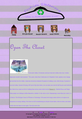
I think the first page of my website turned out very well. We worked very hard on it, and I really like the way it turned out. My favorite feature would have to be the banner. I think it looks so cool, and the fact that the hanger is actually mine makes it even cooler. My least favorite feature would have to be the picture of the shorts that is in the text. We plan on changing it to an original picture that we will take when we repurpose our items. Also, I would like to place it in a different area so it doesn't look so awkward. In the future, I hope to change our navigation. Right now, our last page isn't lined up perfectly, so hopefully we can improve the alignment. I would rate my website a 7/10. It could use some work, but overall I think it looks pretty good!
Out of the three websites I looked at, I think Rachel and Peyton's was the best. Their's looked the most put together and creative to me.
Out of the three websites I looked at, I think Rachel and Peyton's was the best. Their's looked the most put together and creative to me.